Anthology Onboarding Redesign
2015
Role: Research, interaction design, UI design
Problem:
The unique model of Anthology's recruiting style requires a somewhat lengthy sign up process for a potential new user. How can we make this feel less cumbersome and intuitive?
Process:
1) UX audit and usability testing
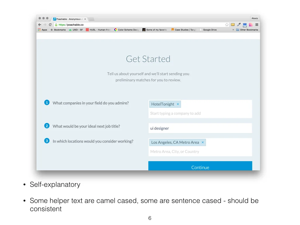
Performed an app and mweb, desktop website-wide audit to assess current UI and UX issues. Conducted usability testing to find out the initial response of brand-new users. Recommended changes based upon the findings. Below pages are a sample of the audit doc delivered.
Since I had limited timeframe, I conducted 5 usability tests using friends and colleagues to get their feedback on the current on-boarding process on desktop and the app. The main feedback provided were:
a) The process seems daunting and there's no clear explanation on why this needs to be done (the on-boarding process consists of 30+ pages).
b) Once the process is completed, there is no instant reward or gratification for completing the lengthy process.
2) Personas
Then. I created two quick and dirty main personas of Anthology's user base so it'll help me explore these screens in their mindset, and also to help me discuss my decisions with my client.
Then I created a new flow with updated screens in Omnigraffle to test out in a quick Flinto prototype.
Wireframe sample
Currently:
Anthology has updated the app on-boarding process and screens per my recommendations, and has seen a positive impact on the completion rate (5.2% increase - what was surprising before was that although the on-boarding process was cumbersome, the success rate was already at 77%). I'm working with Anthology on multiple projects on a regular basis to make the perfect match between a candidate and an employer - and eventually to change how people find the best job of their life.
Thank you


